
- User Experience & Design
Unveiling Dark Patterns in UX: The Thin Line Between Design and Deception

Unveiling Dark Patterns in UX: The Thin Line Between Design and Deception
When we talk about UX design, our minds often paint a picture of seamless interfaces, crafted for accessibility and transparency, aimed at nurturing positive user experiences. But let’s peel back the curtain a bit—UX doesn’t always stay in the light.
Enter dark patterns.
In the intricate web of digital interfaces, UX designers sometimes exploit habitual user interactions to subtly sway behaviors—a manipulation known as dark patterns. These design features, often invisible to users, drive actions that benefit the company rather than the user.
Understanding Dark Patterns
Dark patterns are crafty; they’re the fine print you overlook, the enticing button that leads you astray. They’re disguised elements nudging you into:
1. False Urgency: Fear of running out of resources is what this dark pattern is based on and how it affects a user’s choice-making. The idea behind false rush is called “loss aversion,” and it says that people would rather avoid losses than get gains.
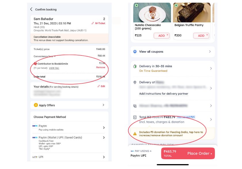
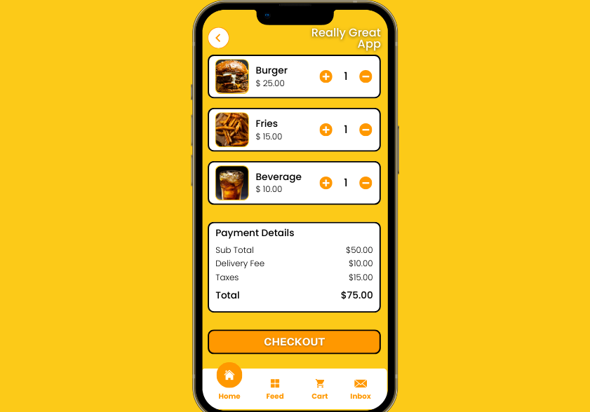
2. Basket Sneaking: Sneakily putting deals or things in the customer’s basket without their knowledge. When the customer gets to the checkout, they either see that there is an extra thing that they didn’t put there and don’t want to pay for it, or they do and end up doing so.
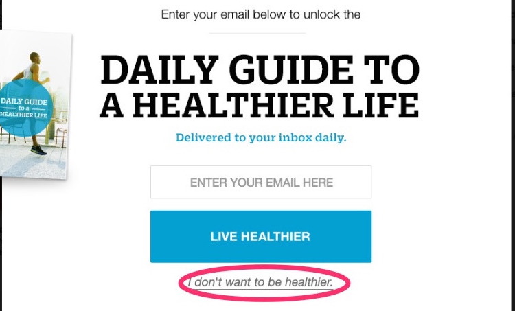
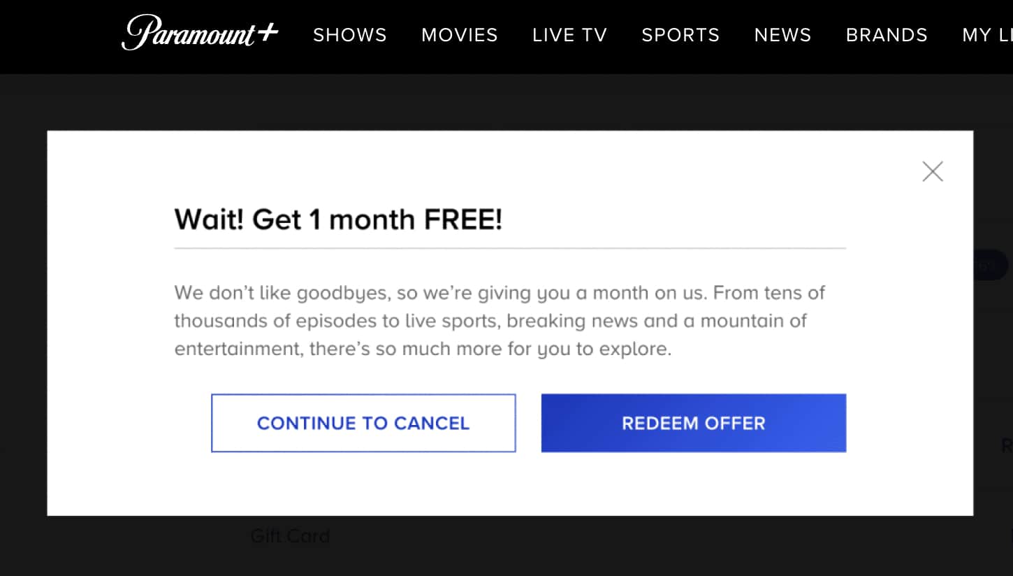
3. Confirm Shaming: This pattern shames or guilt-trips people into quitting or unsubscribing to a service by employing deceptive language and emotionally charged design techniques.
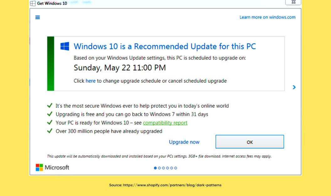
4. Forced Action: This leads to pressuring a user to take a step that would compel them to purchase any more goods or subscribe to or sign up for a service that isn’t linked to what they were initially intending to purchase or subscribe to.
5. Subscription Trap: Users can sign up quite easily under this dark pattern, but opting out is really hard. In essence, it is possible to mentally check out of a service or subscription, but you won’t be able to quickly or ever remove your account or unsubscribe from that service.
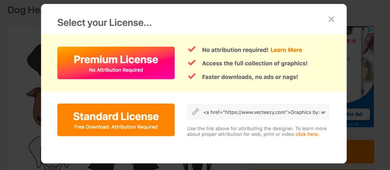
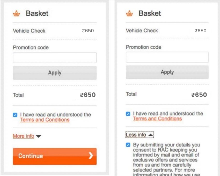
6. Interface Interference: Interface interference is a design feature that intentionally misleads the user and diverts them from the intended action by highlighting one information while hiding other relevant details related to that data.
7. Bait and Switch: a tempting offer that is made to the user in an attempt to entice them but is later replaced with an unwanted offer—either secretly or at a time when the user’s loss aversion prevents them from leaving the process.
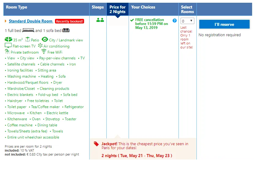
8. Drip Pricing: or Hidden Cost, When a customer reaches the final stage of the checkout process, they may discover hidden fees in addition to the base price of a product or service that was advertised up front on the website. The extra expenses aren’t necessarily limited to taxes; they can also include fees that are added to the base cost of the item or service and that the customer often wasn’t expecting.
9. Disguised Advertisement: Advertisements, advertorials, or sponsored material that mimic other webpage content in order to entice readers to click on them are known as disguised advertising. Disguised advertisements are made to be difficult to identify while a user is idly surfing, making it possible that they will be clicked on without the user realising it.
10. Nagging: A pattern of unexplained activity in which consumers experience an excessive amount of requests, information, alternatives, or interruptions that interfere with their intended purchase of products or services.
11. Trick Question: When read quickly, a trick question looks like it asks one thing, but when read slowly, it looks like it asks something else. Carefully thought out trick questions are meant to get the user to do something that benefits the app or company that asked the question.
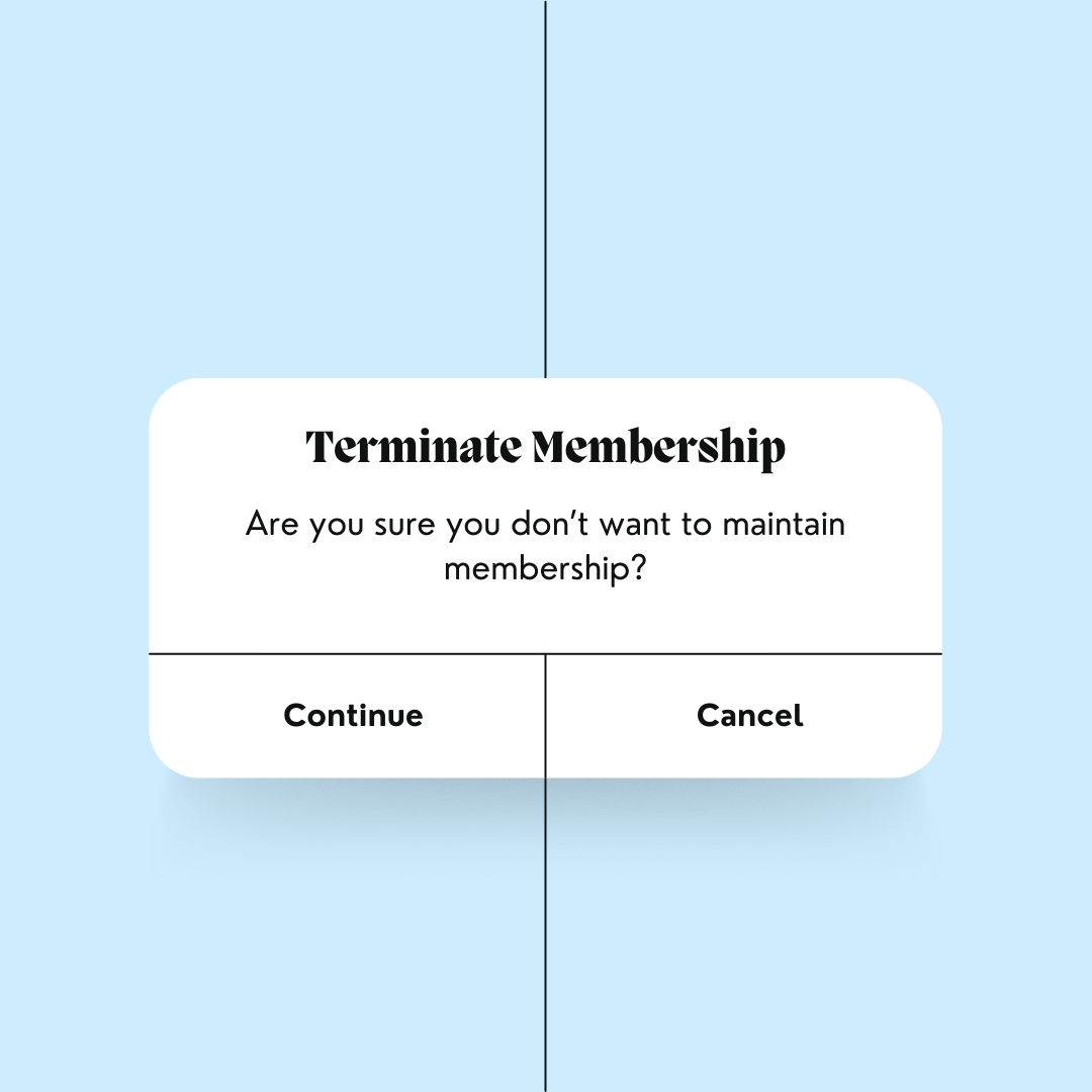
12). Billing Surprise: Users have a hard time using their own judgement to stop service when forced continuation is in place. This happens because the process for stopping the subscription is unclear, hard to understand, or up to the company that extends the subscription in the first place.

Dark patterns exploit our inherent behaviours. Users accustomed to certain interface elements often skim through content, relying on visual cues for actions. These patterns exploit this familiarity, subtly positioning traps where users least expect, leaving them pondering, “How did I miss that?”
But the repercussions extend beyond momentary confusion.
The Fallout
Brand trust, meticulously built, can crumble under the weight of a dark pattern. Deception sours user experiences, leading to negative feedback, eroded trust, and a tarnished reputation. In an era where user reviews hold significant sway, a company’s misstep can spread like wildfire, scorching its prospects.
Ethics Over Exploitation
Beyond legality lies ethics. Good UX is a beacon of transparency, empathy, and user-centricity. Dark patterns? They’re the antithesis. They seek to deceive, not guide; confuse, not clarify.
India, amidst an e-commerce surge, grapples with this shadowy trend. Legislation aims to shield consumers, fostering fairness in online practices.
The Call to Designers
As designers, our canvas shapes experiences. We’re tasked with crafting sincerity, offering clear paths without intentional obfuscation. It’s about bridging the perception gap, not veiling it.
Reflect, fellow designers. We’ve all danced with dark patterns—some knowingly, others unknowingly. Let’s ponder design ethics, for it impacts not just interfaces, but humanity’s digital journey.
Parting Thoughts
Yes, dark patterns might seem like harmless shortcuts, promising instant gains. But their impact reverberates. They erode trust, tarnish reputations, and betray the core principles of UX design.
Remember, good UX isn’t just about conversions; it’s about building trust and fostering relationships. Stick to transparency, empathy, and user-centricity. Uphold ethics in your designs, and the loyalty you cultivate will outlast any short-term gains.
As we navigate the digital landscape, let’s collectively choose light over shadows, transparency over deceit, and ethics over exploitation.
The conversation doesn’t end here:
- Have you encountered these dark patterns in your online experience?
- What measures do you think designers should take to combat them?
- How can users protect themselves against these subtle manipulations?
- Join the dialogue, for together, we illuminate the path towards a more transparent and ethical digital world.
Related content

Auriga: Leveling Up for Enterprise Growth!
Auriga’s journey began in 2010 crafting products for India’s [...]


