- Digital Products & Software
Designed an Interactive User Experience for Facial recognition and signing process

Designed an Interactive User Experience for Facial recognition and signing process
Project brief
faceEsign wanted to develop & redesign a full-fledged platform over their Minimum Viable Product named EzeeBoss, where users can electronically sign documents and agreements with their patented audio/video facial recognition feature.
FaceEsign team reached out to Auriga to help redesign their existing solution(EzeeBoss) to provide a new-age responsive web-app experience for its users and make it compatible with all types of devices (desktops, mobiles, tabs).
How did we help?
#Product Design #Flow Diagram
Auriga’s design team worked with the faceEsign team to redesign their MVP EzeeBoss to improve the users’ overall experience when interacting with the platform. While keeping the customers in mind, the Auriga Design team created the essential skeleton and appropriately structured all its components and elements to make the user flow.
Our objective and constraints
- Redesign user flows to achieve the tasks defined as part of the original MVP for all three sub-modules (i.e. eSignature, bulk file transfer, and encrypted email)
- Designing a new web-app experience
- Multi-device compatibility for desktop as well as mobile users
- Underlying technology and flow are already defined
- MVP product (EzeeBoss) guides the core flow
- Unavailability of detailed user research
Understanding existing product and audit
We studied the product and design in detail. It helped us in understanding the flow and defining usability issues.

Market competitors
After the UX Audit, we first studied faceEsign’s competitors to understand the domain and identify market trends and patterns.

Designing application flows
The product’s core flow for MVP was created before we stepped into the project. To work on improving the user journey and enhance the product experience, we had to new build all the module flows and system integration.

Information Architecture
faceEsign’s new set of improved task flows needed a comprehensive Information Architecture that would help the user achieve their jobs effortlessly. It was intended to reduce the learning curve and increase optimization by adding easy to find entry points.

Ideation
Exploring screen layout and information grouping. We laid out several concepts as low-fidelity designs for quick brainstorming.

Building wireframes
We created high fidelity design sketches for screen layouts for the system based on the task flows and information architecture.

Establishing a fresh and scalable design library
When the visual principles were laid out, we created a design library which incorporated reusable design elements. Using such kind of practice helps in making the product scalable, easy for designer developer handoff and file hand off to the designers who would use it later.
- Started working on the initial stage of the Design System that will scale
- Purposeful use of color, elements, and typography
- Help in design consistency, faster development, and future updates

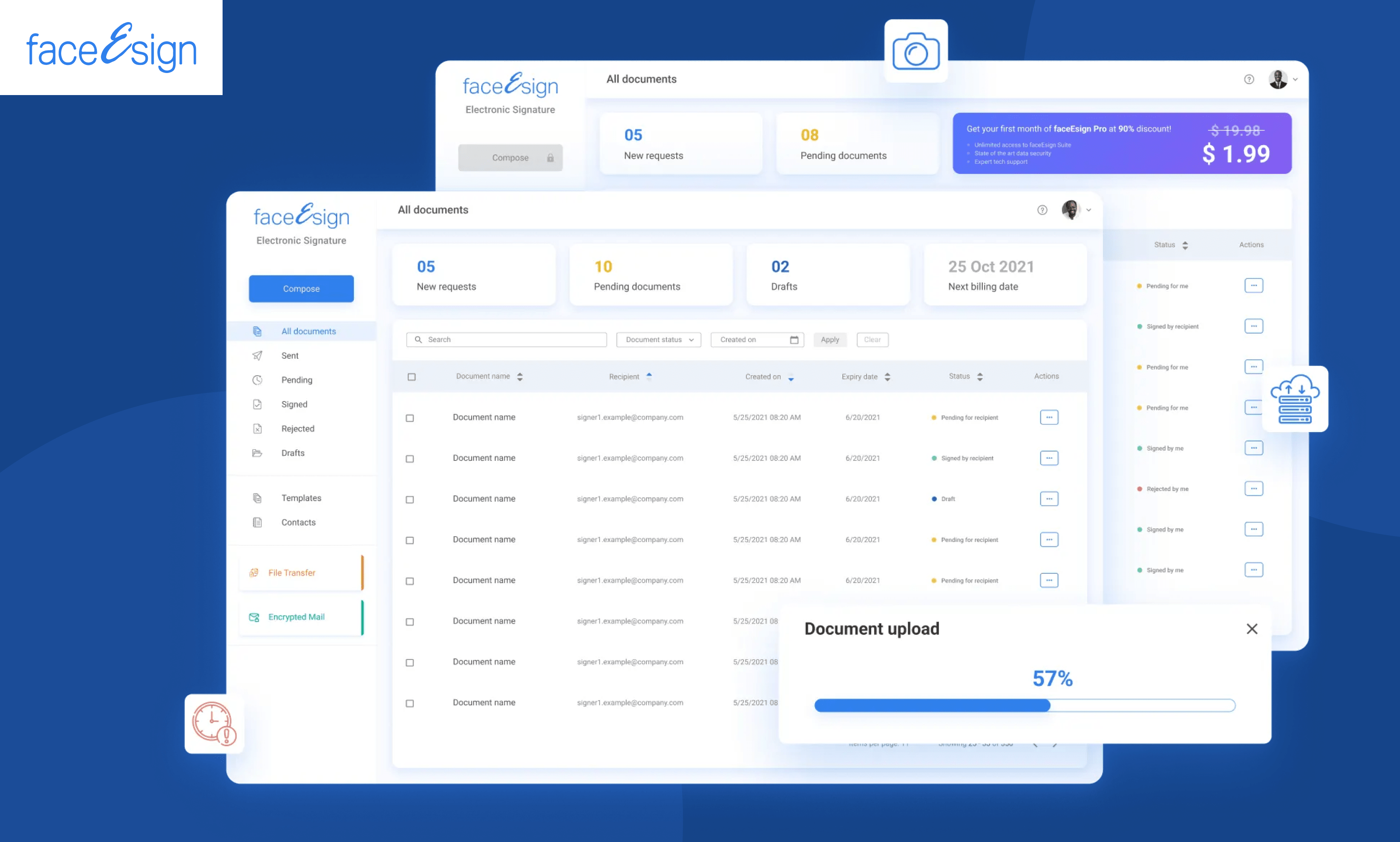
eSign dashboard and request creation
The dashboard lists all the created and received requests. Users can create a new eSign request from the dashboard based on their subscription settings


Signing a document
Based on the signing user’s status and method, this module has different flows, such as a subscribed user, guest user, signing with or without AV, etc.


Mobile responsive screens
Since today’s audience prefers mobile first, when the desktop screens were finalized, we created the mobile designs. We converted them using the foundations of “Bootstrap”, a commonly used responsive design framework.

What’s ahead
faceEsign is set to launch in mid-2022. After closed beta testing, the team has plans to begin user testing to further iterate on the product’s design, features, and functionality.
Related content
Auriga: Leveling Up for Enterprise Growth!
Auriga’s journey began in 2010 crafting products for India’s [...]
Stay Close to What We’re Building
Get insights on product engineering, AI, and real-world technology decisions shaping modern businesses.


