Turno
Designed Mobile web experience for cargo EV financing platform
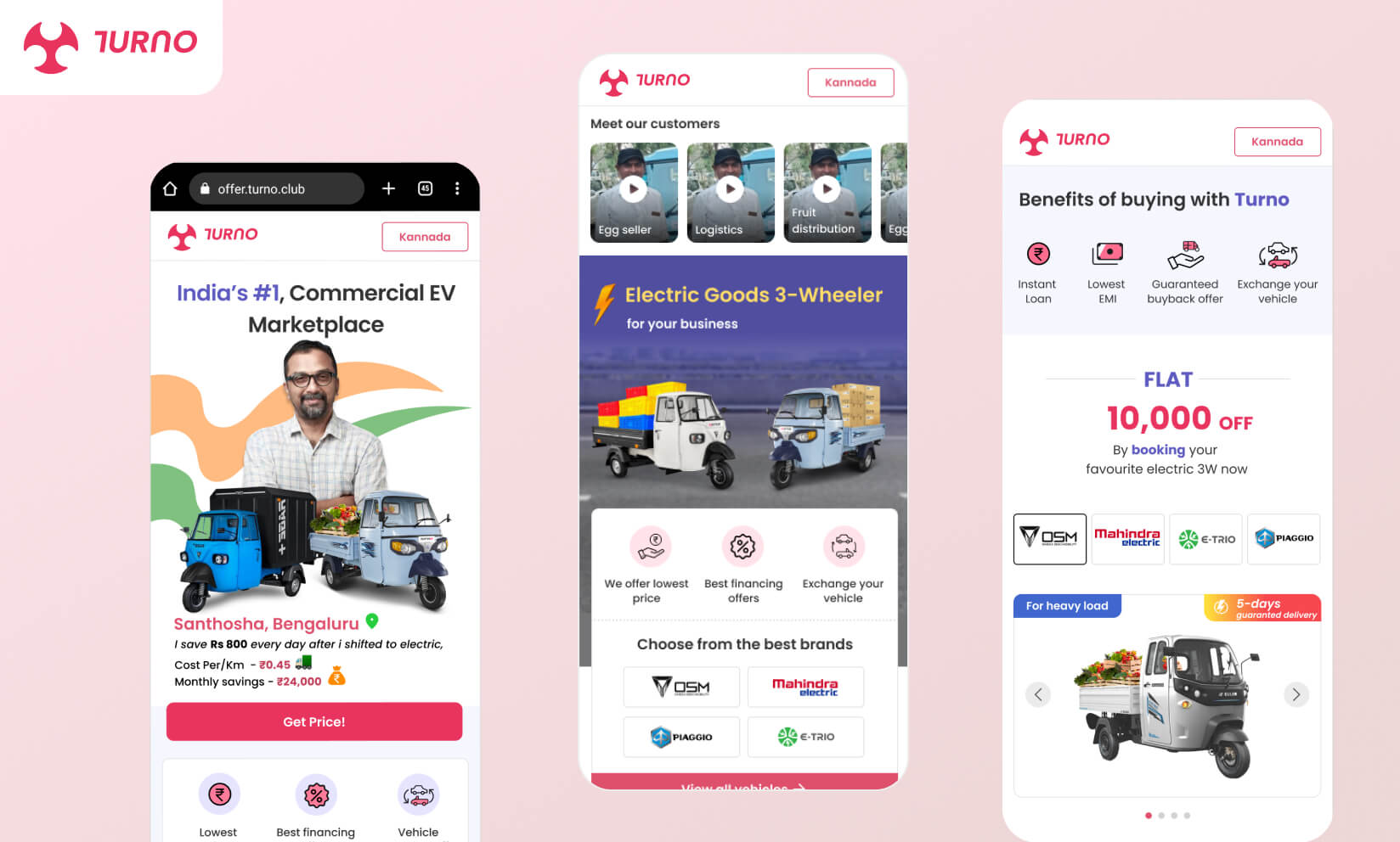
Turno is a loan finance company which helps people buy cargo electric vehicles such as electric 3 wheelers for commercial purposes only such as groceries delivery, milk crates delivery, e-commerce transportation etc.
Turno’s website acts as an aggregator which catalogs EVs from different manufacturers and makes it easy for customers to buy them by simply letting them book the vehicle online, take a test ride. Turno offers them loans since banks do not do so as they don’t have a good credit rating.
Problem statement
Turno’s target audience is the folks who use fuel powered cargo or non cargo vehicles. Some of them run their small delivery and transportation business, some work in the logistics departments of different companies. They use mobile apps such as Instagram, Facebook, YouTube, WhatsApp but are not much tech savvy. They are also not good with the jargon words. Currently it focuses only on the users of Bengaluru (India).
The main requirement was to create a mobile website which can communicate the users the brand offering, the savings with EV and make them quickly book a vehicle. It was a challenge since their target audience is not very good with websites.
Once the vehicle is booked the users would be contacted offline to close the deal.
How we helped
#ConversionThroughDesign | #AutoLoanEV | #SolutionStrategy
Since the users are not very much familiar with technology, we first tried to understand the patterns from the product they use, such as mobile apps like Instagram, Facebook and more. We took some important elements such as videos, stories, big graphics etc. The field team provided us with the words and terminologies potential users use. We then started to ideate the user journeys.
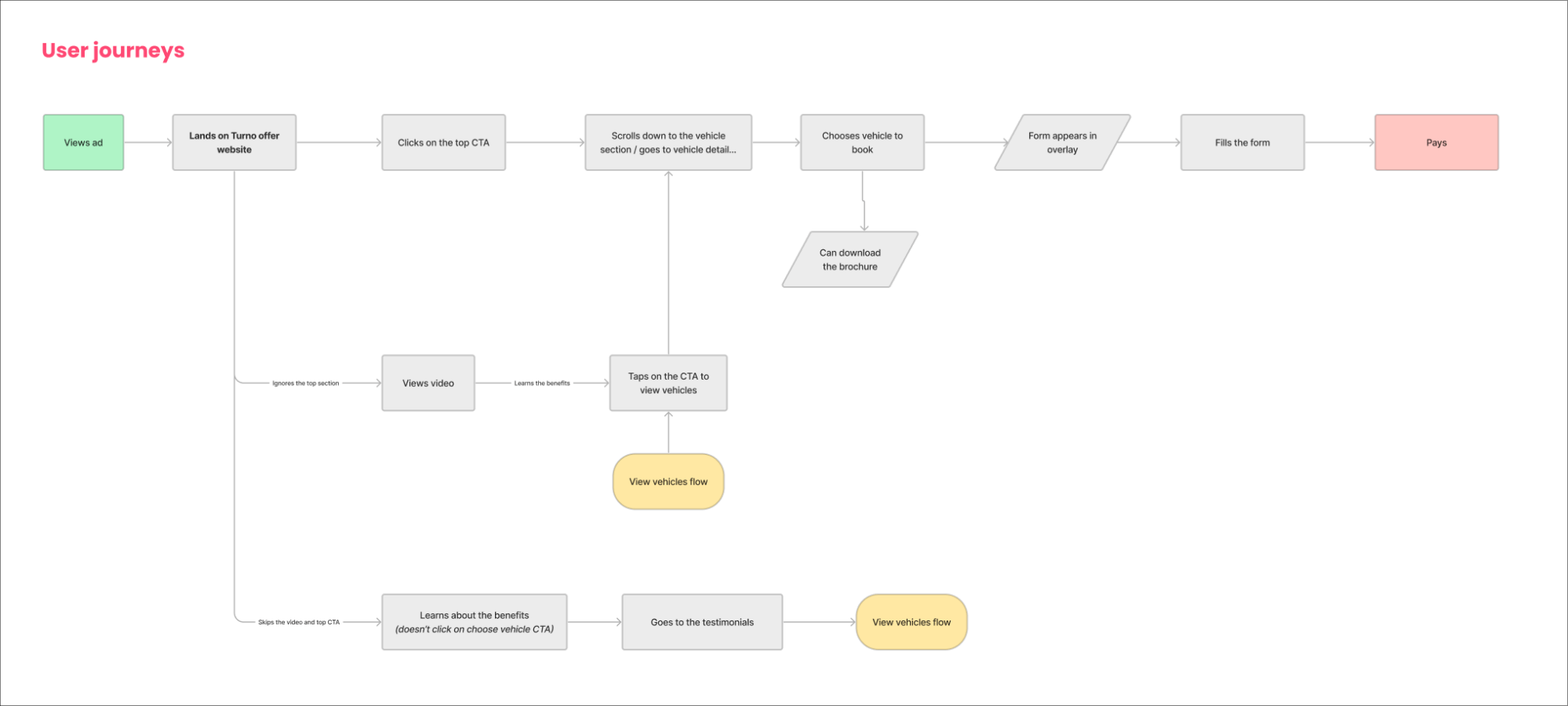
We created multiple wireframes for different approaches. Since our users use social media at night after their work is done, we decided to run ads on social media leading them to our website. As Turno was just starting and setting up, we experimented with different homepages. We designed some sections and changed their layouts, positions and integrated analytics tools. We published these kinds of experiment sections on the homepage for a period of 7-15 days.
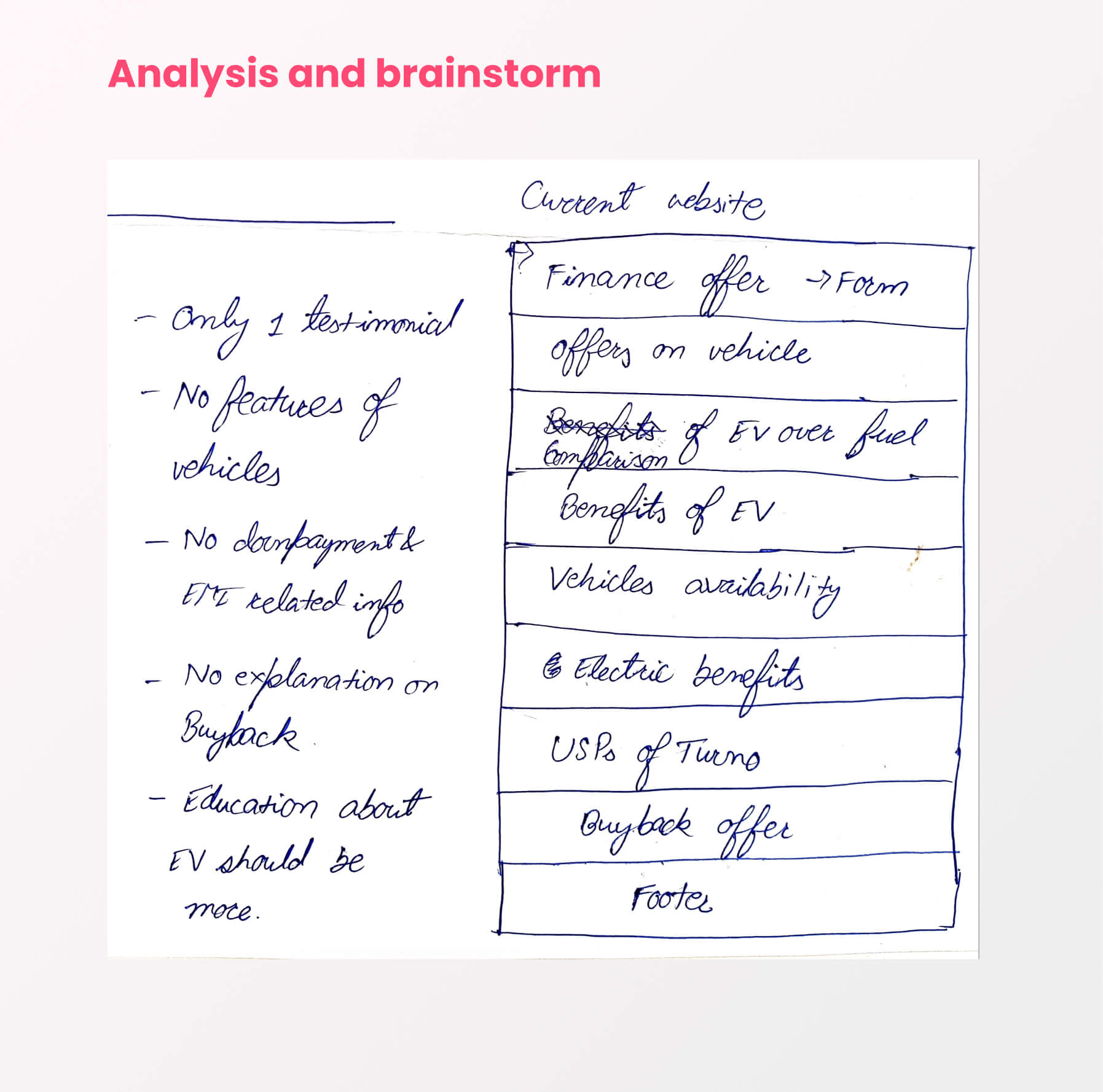
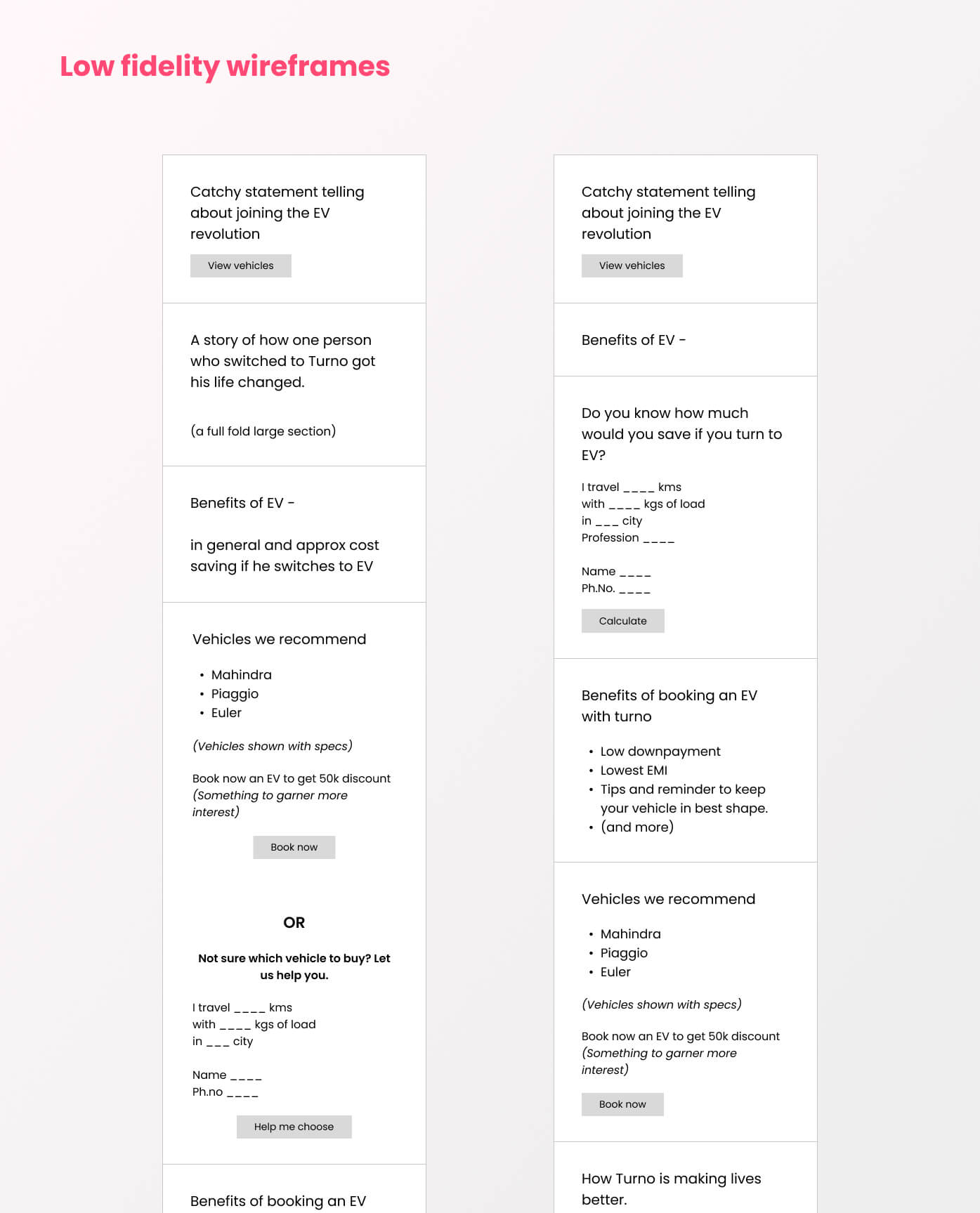
The analytics tools provided us with the insights to where the users interacted most and least, where they clicked, where they stopped, which part they skipped, and where they spent the least amount of time. On the basis we decide our next strategies to design new or update existing sections. All of this was a looping, iterative process.
We started with a single page website and reached to a 3 paged one where users could access EVs, benefits of Turno, check all vehicles’ details, read testimonials to garner more trust. The last milestone of this journey was to make them fill the form to book the vehicle.
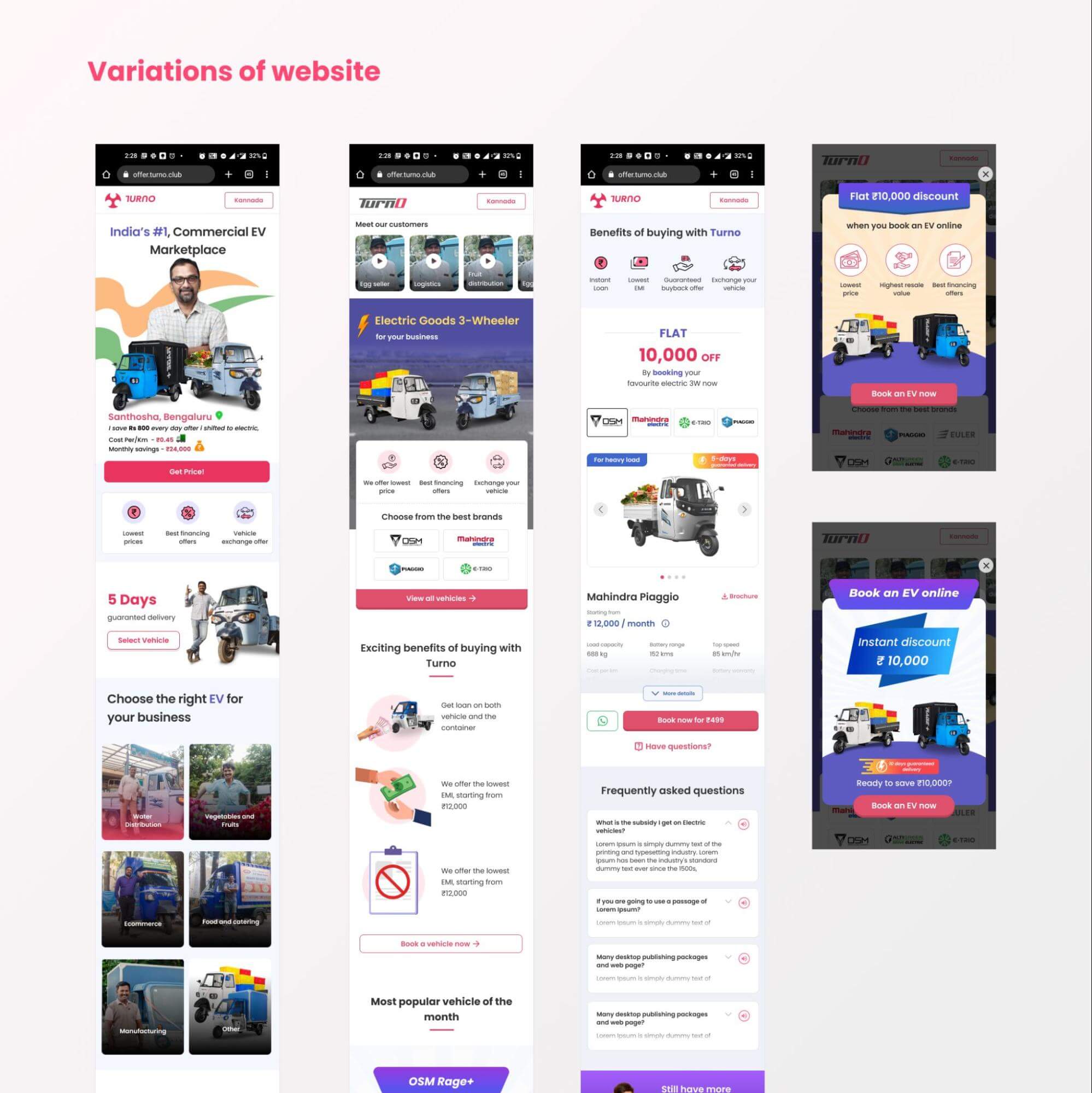
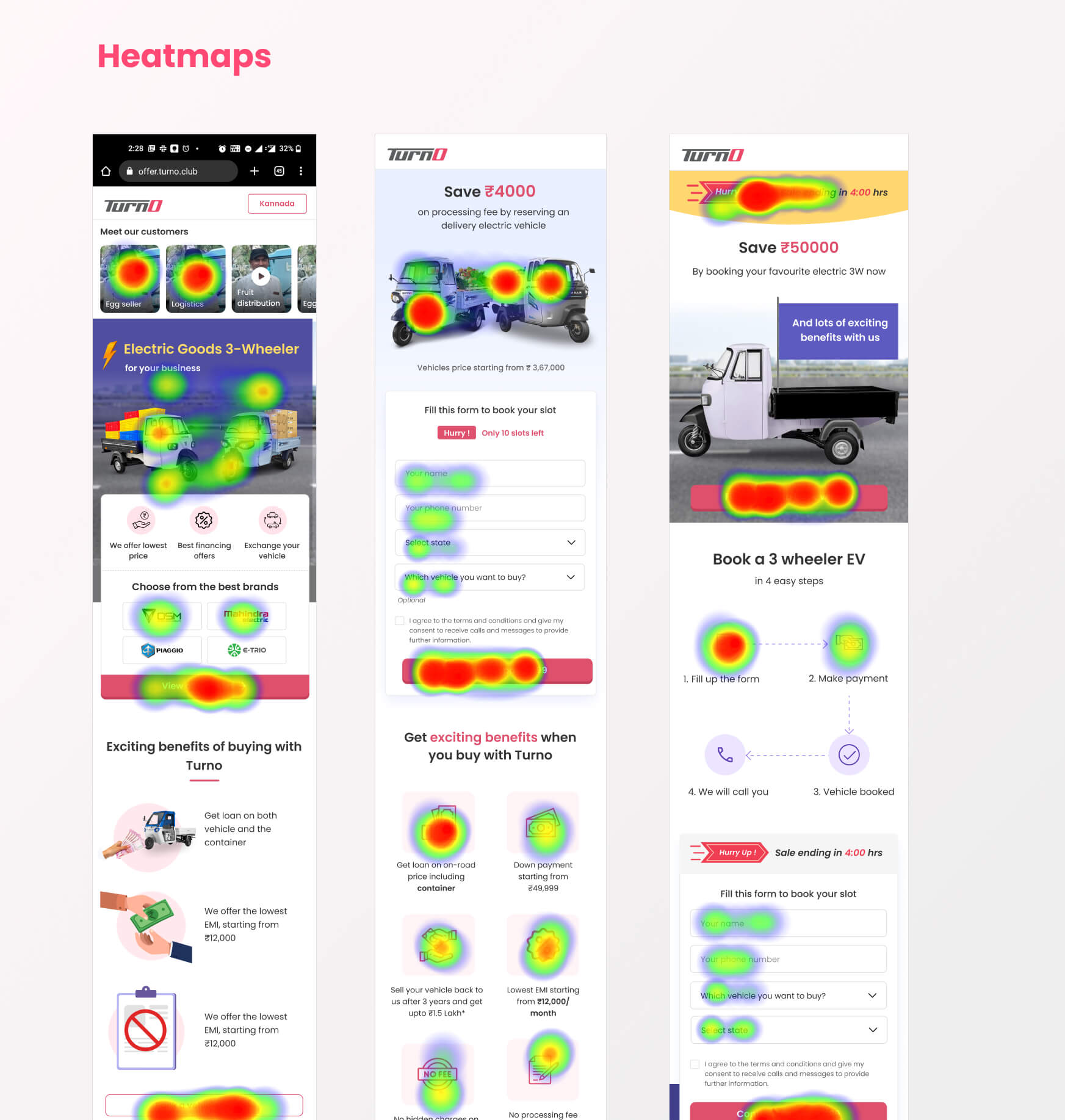
Using this mechanism, we were able to increase our booking rate i.e. users visiting our website, booking the vehicle to 40% in just 3 months.
Related Case Studies

SLA Financials
