Pinkvilla: Giving India’s Largest Entertainment Platform a Product Experience That Matches Its Content
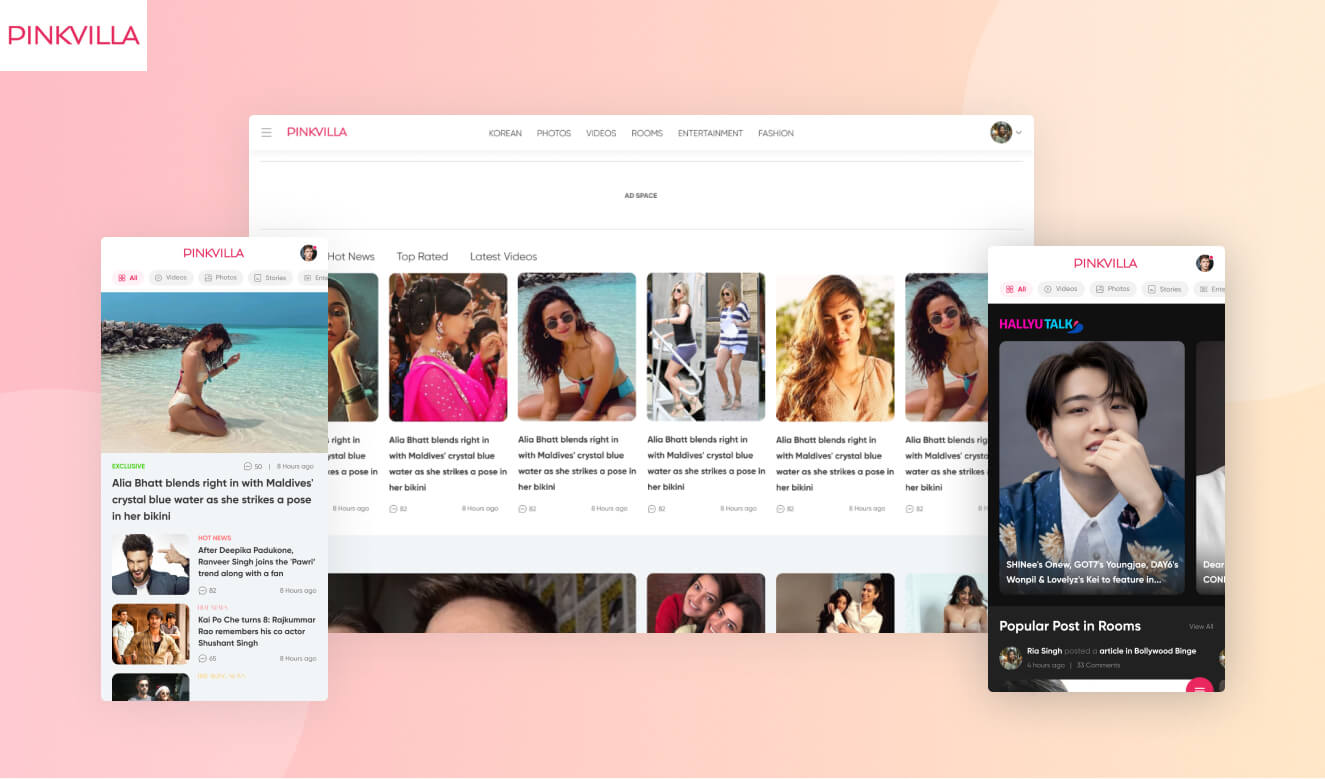
Pinkvilla: Giving India’s Largest Entertainment Platform a Product Experience That Matches Its Content
Pinkvilla, one of India's largest entertainment and lifestyle platforms with over 50 million monthly users, partnered with Auriga IT to redesign its website and mobile app, fixing low engagement on video and rich media, unclear user-generated Rooms content, and an app with no reason to install.

One of India's leading entertainment and lifestyle platforms, Pinkvilla covers Bollywood news, celebrity updates, television, fashion, and beauty content. The platform wanted to increase user retention and engagement, and improve the experience across web, mobile web, and the native app.
Five Specific Problems Were Holding Back Engagement
Pinkvilla had strong content and a massive audience, but the product experience was not built around how that audience actually consumed it.
Rich content underperformed. Videos, podcasts, photos, and stories saw proportionally less engagement than standard text stories, despite high production quality.
Every category looked the same. Specialised categories had no distinct visual identity, so nothing felt different from the standard feed.
Rooms felt like Pinkvilla content. Users could not tell that Rooms was user-generated content, and many assumed Pinkvilla had created it directly.
Original video had no traction. Pinkvilla's high-quality original video content was buried deep in the navigation and was not getting watched.
The app had no unique selling point. With nothing the app offered that the website did not, users had no real reason to install it.
Every Decision Made Around How 50 Million Users Actually Browse
The team began with a usability and visual audit of the existing website, which surfaced two structural issues: several important pages had never been added, and others existed but were losing visibility by sitting too deep in the navigation to be found.
Since most of Pinkvilla's audience consumes content on mobile devices, every design decision was made mobile-first. The information architecture was rebuilt around actual content hierarchy, so the pages users cared about most were also the easiest to reach.


Five Targeted Fixes, Each Solving One Specific Problem
The website and app were running on old design patterns that no longer matched what users expected from a modern media platform.
The visual style was rebuilt from the ground up across both website and app, paired with a documented set of design principles so future iterations could scale consistently instead of drifting from page to page.


Every category, regardless of content type, used the same look, so specialised sections never felt distinct from the standard feed.
Specialised categories got their own interface treatment while staying within the same overall design language. The Korean entertainment category moved to a dark theme to set it apart, while video-heavy sections now lead with bold, prominent thumbnails instead of blending into a text-first layout.

Users browsing Rooms often assumed Pinkvilla had created the content directly, when it was actually user-generated.
The navigation order was restructured so "My Rooms" appears first in the header, followed by popular rooms and a clear option to create a new one. Leading with the personal, user-owned entry point makes the user-generated nature of Rooms obvious from the first interaction.

Video was one of Pinkvilla's most-consumed content types, but it was buried inside menus instead of being easy to find.
Video moved into the top navigation, and a dedicated video page was built with a full-screen, story-style player on mobile, matching how audiences already consume short video on platforms like Instagram and TikTok rather than forcing a desktop-style player onto a mobile-first audience.

The app offered nothing the website did not, so users had little reason to install it over simply browsing in a mobile browser.
Short-form videos and quickly consumable news briefs were made app-exclusive, designed with the same fast, swipeable interaction patterns users already know from Instagram, TikTok, and Inshorts, giving the app its first genuine reason to exist alongside the website.

What Changed for Pinkvilla
Content Now Findable
Pages previously buried deep in navigation are reachable within the redesigned information architecture, built around actual content hierarchy. Video sits in top navigation with a mobile-native story-style player.
Rooms Reads as Community, Not Editorial
"My Rooms" now leads the header, followed by popular rooms and the create option. Users recognise from the first interaction that Rooms content is created by other users, not by Pinkvilla.
Categories Feel Distinct
The Korean entertainment section now runs a dark theme. Video-heavy sections lead with prominent thumbnails. Each specialised category has its own interface treatment within the shared design language.
App Has a Reason to Exist
Short-form videos and news briefs are app-exclusive, using swipeable patterns from Instagram and Inshorts. The app now offers something the mobile website does not, giving users a genuine install reason.
A high-traffic media platform can close the gap between content quality and content discoverability without a full rebuild. The Pinkvilla redesign shows that a usability audit, a mobile-first information architecture, and targeted interface changes per content type can each fix a specific engagement problem without disrupting the rest of the platform. Any entertainment or media platform with a large mobile audience, buried rich content, or an app competing with its own website will recognise this pattern.

Prithviraj Singh Hada is Principal UX Designer at Auriga IT, where he built the design team from scratch. He founded DesignKul, Jaipur's UX design community, and mentors design students as visiting faculty at institutions like VGU and JNU. He has led UX work for clients including Vedantu, TCS, and Lupin Digital Health.
View LinkedIn Profile →Frequently Asked Questions
Pinkvilla is one of India's leading entertainment and lifestyle platforms, covering Bollywood news, celebrity updates, television, fashion, and beauty content, with over 50 million monthly users across its website and mobile app.
The redesign addressed five problems: low engagement on rich content like video and stories, specialised categories with no distinct visual identity, unclear user-generated Rooms content, original video content with poor traction, and a mobile app with no unique reason to install.
The navigation order was restructured so that "My Rooms" appears first in the header, followed by popular rooms and an option to create a new one, making the personal and user-generated nature of Rooms clear from the first interaction.
Video was one of Pinkvilla's most-consumed content types but was previously buried inside menus. Moving it to top navigation, alongside a dedicated story-style mobile player, matched how the audience already consumes short video on platforms like Instagram and TikTok.
Short-form videos and quickly consumable news briefs were made exclusive to the app, using fast, swipeable interaction patterns similar to Instagram, TikTok, and Inshorts, giving the app a genuine reason to exist alongside the website.
Yes. Since the majority of Pinkvilla's audience consumes content on mobile devices, the entire redesign, including the new information architecture and category-specific interfaces, was designed mobile-first before being adapted to desktop.
The Pinkvilla redesign was led by Prithviraj Singh Hada, Principal UX Designer at Auriga IT. He covered the usability audit, information architecture, and the visual design system applied across the website and app.
Looking to Redesign a High-Traffic Platform?
Auriga IT designs and redesigns websites and apps for platforms with large, mobile-first audiences, from information architecture through visual design systems.
Talk to Our Design Team →
Related content

Auriga: Leveling Up for Enterprise Growth!
Auriga’s journey began in 2010 crafting products for India’s [...]