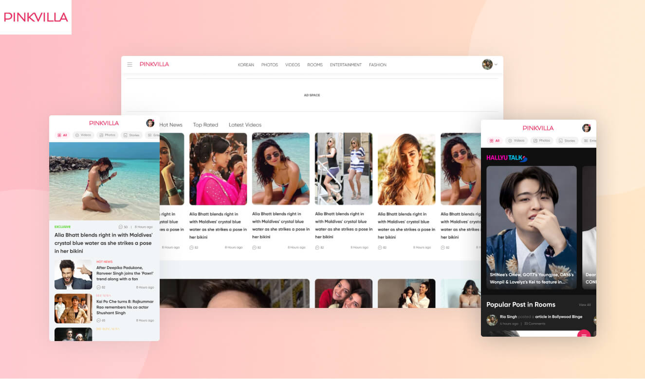
Redesigned an Indian entertainment and fashion news platform

Redesigned an Indian entertainment and fashion news platform
Pinkvilla is a popular Indian entertainment and lifestyle website offering the latest news, gossip and updates in the Indian film and television industry as well as fashion, beauty and lifestyle content. The site covers a wide range of topics including Bollywood news, celebrity gossip, movie reviews, fashion and beauty tips. Pinkvilla has a huge following and is recognized as the leading source for Indian entertainment news and updates.
It has a website and a mobile app, on which there are currently 50 million monthly users visiting it.
Problem statement :
Pinkvilla wanted to increase user retention, activeness and wanted to enhance the experience on all of the platforms: website, mobile website, mobile apps. For this it partnered with Auriga to rectify the issues. Here are some of the problems such as :
- Engagement on rich content formats (videos, podcasts, photos, stories etc.) was proportionally less than the standard Textual story.
- All of the categories had the same look and feel, so specialized categories do not feel different.
- It is not intuitive to a user that Rooms Content is UGC (User Generated Content). Many users still perceive the room’s content as Pinkvilla content.
- PinkVilla had high quality Original Video content, still they were not able to get traction on the website for video consumption.
- App doesn’t have USP due to which users don’t install the app.
Our approach

First of all we analyzed the website for the usability and visual issues and discovered that some new pages had to be added, some pages were losing visibility due to being hidden deep inside.
We laid out new design principles with our approach keeping the mobile audience in mind first since the majority of their users consume content on the mobile devices. We created a new information architecture of the pages in order of their hierarchy for better visibility of the pages.


How did we solve these problems?
Let’ go through them one by one
1. Increasing the engagement by improving the visual style.
The website and app had been using very old design patterns. The old visual style was outdated, and the redesign brought a fresh and modern look that resonated better with the users, resulting in increased engagement. By redesigning the visuals, we made both the website and app more user friendly. We created visual design principles for scaling the designs in future iterations.


2. Different look and feel for special categories
For the special categories we created new interfaces while keeping the overall experience similar to maintain the consistent user experience. Korean was designed in dark themes to provide a distinguishing experience while rich content like Videos now appear with bold thumbnails.

3. Making Rooms experience more clear that these are User Generated
Previously users coming to rooms used to think that rooms are created by PinkVilla but actually those were created by users. The major issue was lack of clarity. To make those more clear, we kept the 1st link in the header bar as “my rooms”, followed by popular rooms and the option to create rooms on top. This way made it more clear that one can create rooms.

4. Not getting enough traction on the videos
One of the most consumed types of content on PinkVilla is videos, but the category was hidden inside menus and was not easily accessible. Also with the rise of Instagram and TikTok, today’s audience prefers short videos. So we decided to move the videos in top navigation. We also designed a dedicated page for the videos which open in the stories kind of experience in mobile phones.

5. Adding app exclusive experiences to increase the app usage
To increase the user base on the app, we decided to keep some features on the app only. Those were short videos and the briefs, which contain quickly consumable news and stories. Since the mobile audience prefers shorter content, the interface and experience was kept like the other popular apps such as “Instagram, Tiktok, Inshorts” etc.

Related content
Auriga: Leveling Up for Enterprise Growth!
Auriga’s journey began in 2010 crafting products for India’s [...]
Stay Close to What We’re Building
Get insights on product engineering, AI, and real-world technology decisions shaping modern businesses.


