- User Experience & Design
Reimagined the experience for an EdTech platform to boost traffic, conversion and engagement
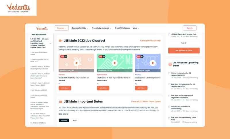
Reimagined the experience for an EdTech platform to boost traffic, conversion and engagement
Vedantu is an Online Learning Platform for K1 to K12, CBSE, ICSE, JEE & NEET. Each month, over 35 million users’ access Vedantu through its app and web. Vedantu also provides extensive free learning material including books, solutions, sample papers, revision notes, syllabus, subjective & objective Tests for CBSE, ICSE, State Boards, competitive exams etc.
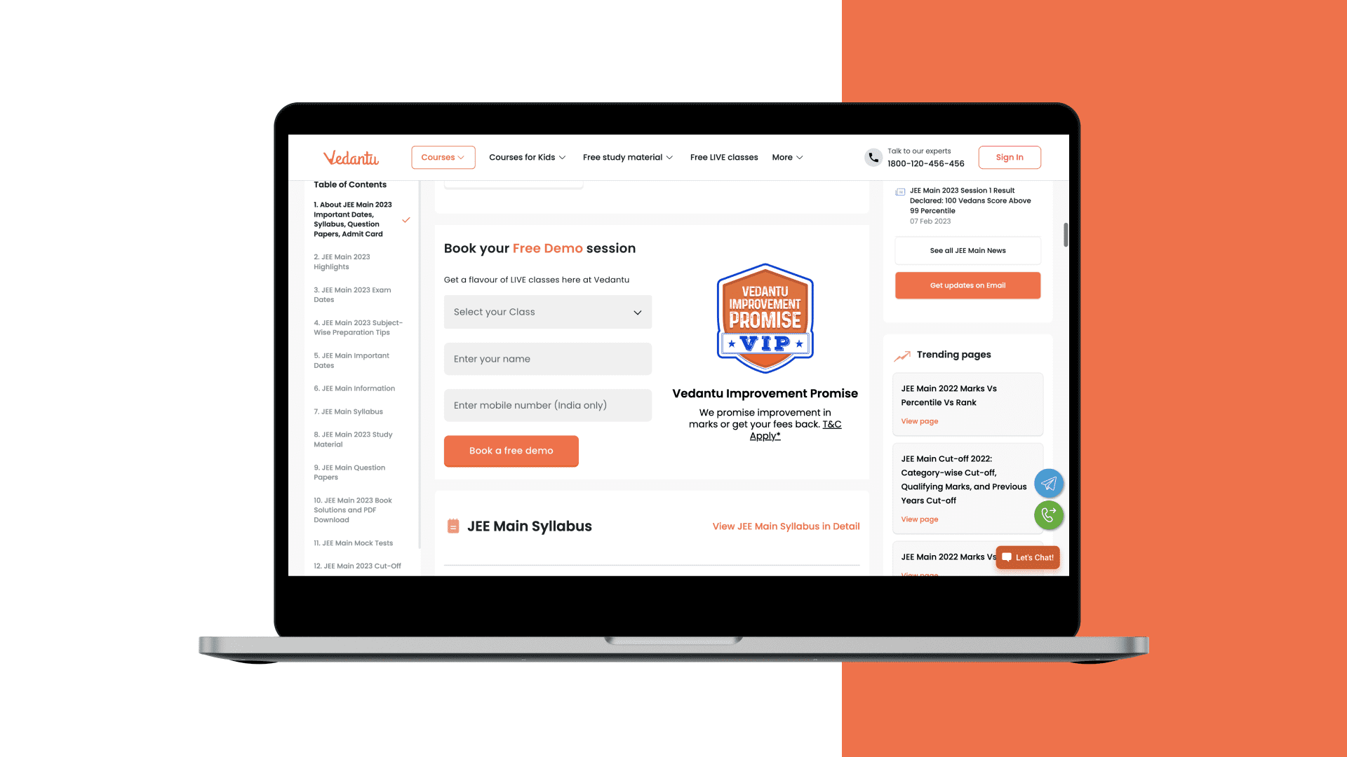
As their design partner, Auriga worked with Vedantu to create an experience strategy and re-imagine the Free Study Material and examination pages to boost retention, conversion and engagement
How we helped
#Product ReDesign | #User Research | #Competitor Analysis
Auriga’s design team collaborated with Vedantu’s product, content and design team to understand the goal of free study material pages, target audience and gaps in the user experience. These pages are designed as the landing pages for the students who are looking to access free study material for various exams on search engines. Vedantu also wanted the students to become more aware about how Vedantu’s learning platform and teachers can help students get the quality education in any corner of India at affordable cost.
Content Strategy
Auriga started the project with competitors’ research and analysis to develop the proposition to capture new students. To drive more traffic to the website, it was important Vedantu’s website appear on top ranking on search engines for the various keywords used by students to search free study material. Auriga’s team studied the keyword research done by the marketing team, explored how competitors are curating the content, built the content strategy, prepared the list of components that should be available on the pages and suggested how the keywords should be placed.
Launch landing pages easily and quickly
There are 100’s of pages in this module with a lot of content and it was time consuming to launch or modify pages as it was difficult to manage content keeping quality design in mind. It was very important that the page layout can be divided into various small widgets which can be updated independently and can be used at multiple places to increase the modularity and scalability. Page structure and widget were designed in such a way that the content manager can focus on a single widget at a time without worrying about the quality of design.
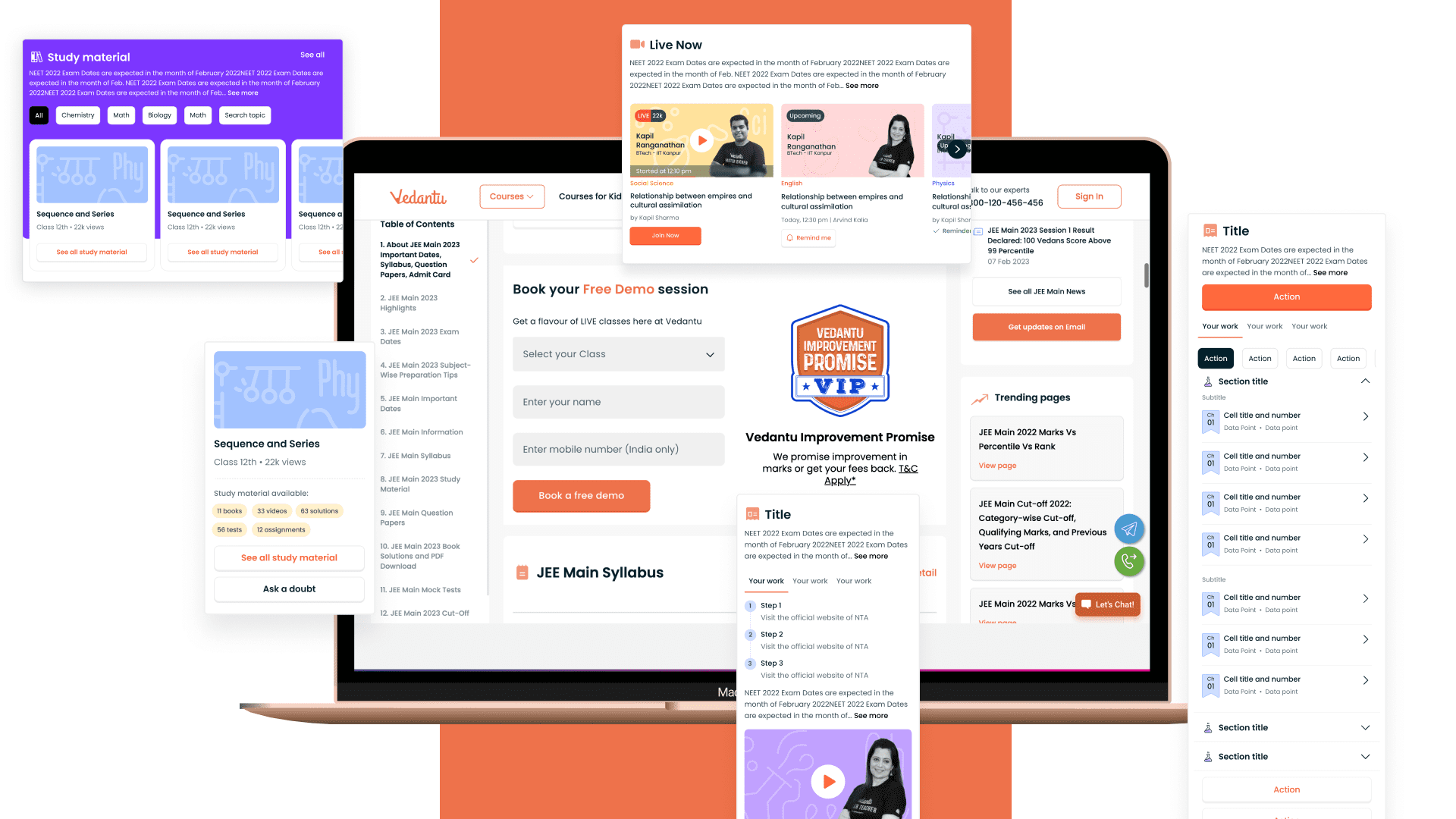
Revamp User Experience
There was too much content on these pages and it was important to redesign these pages on the heuristic principles to improve the content discoverability
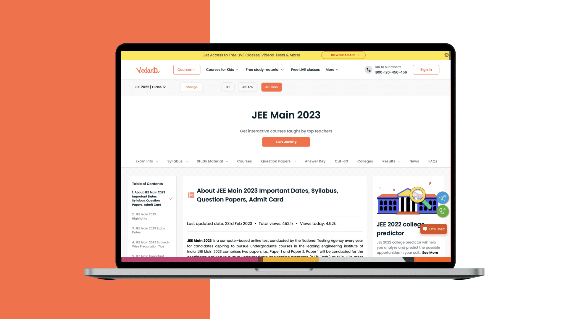
Hook Users
Another goal of this page was to give users a glimpse of offerings of Vedantu and place the call to action buttons at the right places to allow students to navigate to other offerings. By mapping the end-to-end experience and identifying gaps in the current design, the team was able to highlight key opportunities for strategic improvements and redesign these pages.
Highlights
- 75% More Visitors- Better visibility and reach in search engine for targeted keywords increased the traffic to these pages by 75% within 1 month
- 34% More Leads- Compelling visuals, clear calls-to-action, and an optimized user journey brought 34% more leads.
- 10% more sign ups- A 10% increase in sign-ups by using intuitive navigation, clear messaging and intuitive widgets design.
Related content
Auriga: Leveling Up for Enterprise Growth!
Auriga’s journey began in 2010 crafting products for India’s [...]
Stay Close to What We’re Building
Get insights on product engineering, AI, and real-world technology decisions shaping modern businesses.


